This article breaks down two important features from the version 8.0 Android app update available in late November 2020. Find the right sales more efficiently with the updated Keyword search feature. With a style update the latest app aims to be easier on your eyes (literally) by reducing how often you switch between looking at something that is bright and something that is dark.
Keyword Search
Before we get into the new features let’s review how the list works. The list view is accessible by selecting the menu button at top right. Here you can see the same sales from the map, listed with titles and brief summaries for each sale. The list is sorted so that the top most sales are the closest to your search location (your GPS location or your Location Search location if you are using the advanced feature). A caution graphic may also appear if the sale address looks incomplete. Reference this tutorial graphic for a more details on how the list view works.
This list view has been completely overhauled for speed and to filter search terms as each character is typed. The matched text is highlighted within the list so you can quickly see the context of search term you are looking for. This update also fixes a problem where sometimes the filtered search term is not highlighted. The search term applied will also automatically highlight matched text in the sale page as well.
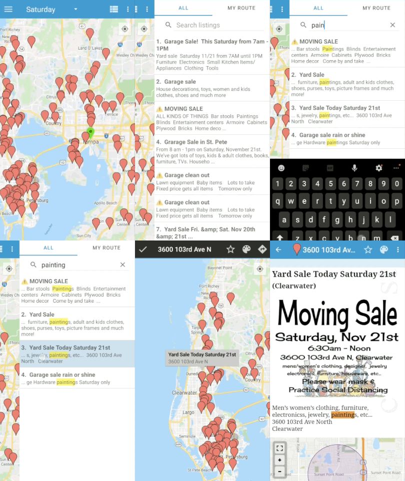
- Open the list view
- Enter a search term
- Select a row to find on the map
- Tap the sale to view the listing
If the sale looks good get organized by adding it to your route and setting a marker color.
In this example, notice how the search term “painting” filters to the four results with this keyword. Selecting the sale in the list will center the map on the sale. Taping the sale on the map opens the listing and shows the word “painting” highlighted in orange to draw your eye to the important treasure-related details.
Dark / Light Mode
Fun fact – if you don’t enjoy searing your irises by staring at a bright white phone screen try opening Settings→Display and turning on Dark mode. You can also enable your phone to switch between light and dark modes depending on the time of the day. Dark mode actually saves battery too — it takes more juice to turn your screen pixels white than black, so a dark screen uses far less battery.
Apps need to actively support this feature and now Yard Sale Treasure Map is one such app (“it’s about time!” yells a heckler from a yard sale across the street).
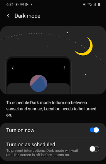
This update adds proper style support for Dark / Night mode. This is actually a bit backwards because the older app design had dark mode styles baked in with dark backgrounds and white text… then we let you choose a dark or light map style only. This is all sort of embarrassing from an app designer-perspective. Let’s pretend like that never happened and move on to the new stuff.
With the latest update the style change now effects the entire app. By default AUTO is selected, which makes the backgrounds and text colors match your Display settings in the Android Settings app.
You can override the color style in the Settings menu in the Style option. Note that the map color will change immediately, but the app style will not be applied until the app itself is restarted. Otherwise the app would need to restart IMMEDIATELY to make your style update, and that’s just obnoxious.
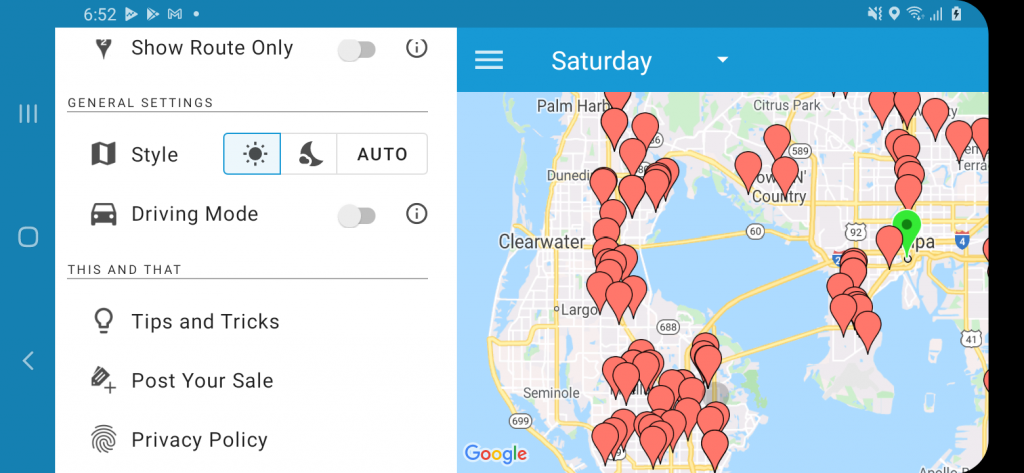
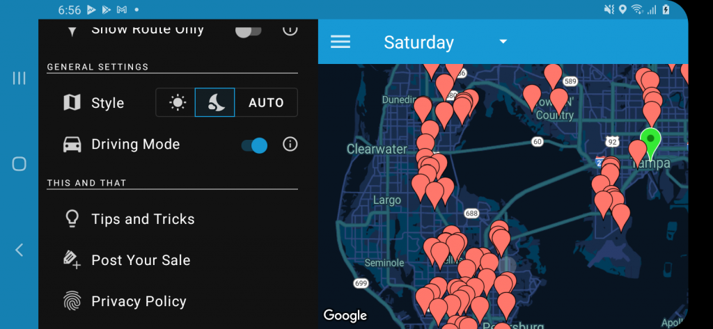
As you can see from these images we are mostly taking about white vs black text on a black vs white background applied throughout the app, including the sale ad pages. The style change basically inverts the white and blacks.
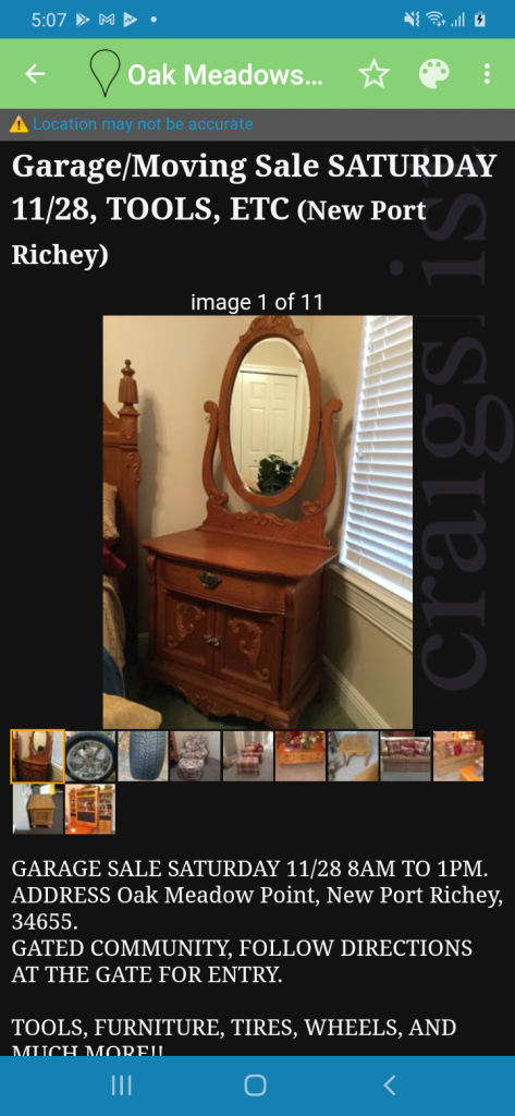
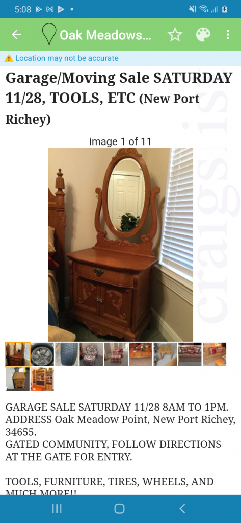
This style update was a long time coming — mostly because of the needed support from Android to flip the colors of the Craigslist web page listings. Now when dark mode is enabled the webpage will have a black background with white text.
Hopefully these updates make your treasure hunting planning a bit more enjoyable.

